How Monster Girl Therapy came to be—and how it found its style.
🇬🇧 English | 🇩🇪 Scrollen für Deutsch!
After using only RPG Maker MZ’s standard assets for my first game Vom Drachentöten, I wanted to draw on the many cool things available on the internet for my second one. That immediately raises a fairly central question: How do I turn all of that into a coherent game?
First, I needed …
A core concept
Very briefly: What IS Monster Girl Therapy?
Take the appeal of a dating sim—including its role as a subgenre in RPGs like Persona or Mass Effect—and add a humorous, subversive look at gender dynamics and other eccentricities our gamer culture has produced. On top, there’s the nostalgia of RPG Maker visuals plus a few minigames and puzzles to keep things varied. (To be honest, I prefer games like VA-11 Hall-A or The Red Strings Club over ‚pure‘ visual novels. Minigames are also just a wonderful way to practice your Maker skills!)

(Short version: Basically a visual-novel-style dialogue game. You find the ‚Pokémon-esque‘ collection book of a slimy mage and can get to know the imprisoned inmates, within an action limit. You also choose to learn more and/or release them. So in a certain sense, it’s a subversion of the genre.)
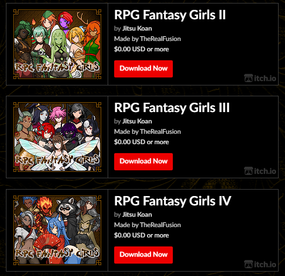
I sent this quick ‚pitch‘ to Jitsu Koan and TheRealFusion almost two years ago—their Monster Girls were what really got me started working on the game! And although it ultimately ended up becoming something else, the monster girls are still its core.
Talking to girls
So, what makes these little illustrations so awesome?
- They have a coherent, distinctive look that fits RPG Maker really well.
- They’re archetypical in the best possible way, with instantly recognizable tropes…
- …but they’re not boring—some of them have a LOT of character!
- They’re just TOTALLY pretty! =D
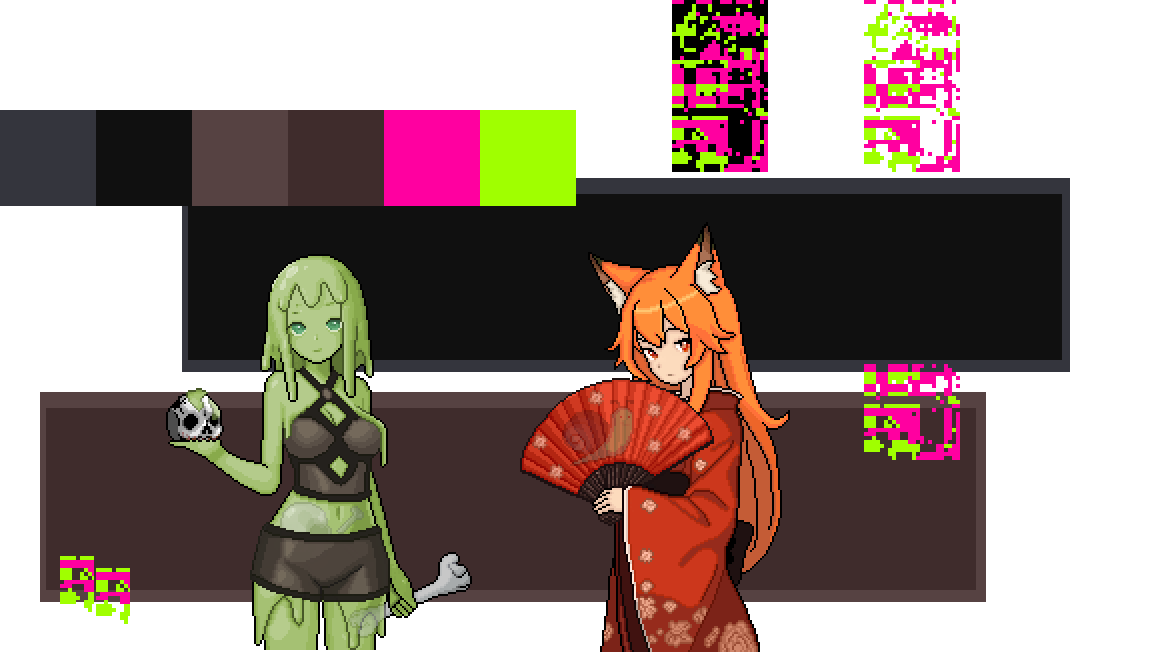
To make sure that comes across appropriately, and because a large part of the gameplay would be reading, I started with the dialogues. The technical side is just a bit of tinkering with four images. (Here’s an old test… Do you recognize the individual elements?)
This time around, the language is meant to be more casual, but I didn’t want a completely insincere parody either—there were way too many of those in the scene back in the day! It was also really important that each monster girl got her own way of speaking. (More on that another time.)
Tickled pink
At this point, it was clear that the game world would be slowly corroding—which is a PERFECT opportunity to give the game a memorable touch or two… namely, neon pink and neon green! Because if THAT doesn’t scream “something has gone horribly wrong!”, at least in fantasy, what does?

In conjunction with the monster girls, a color scheme emerged almost automatically: a colorful yet slightly muted fantasy look, topped off with aggressive graphical glitches. Nice! That would also turn out to be massively helpful two years later, when it came to marketing the game…
Exploring the world
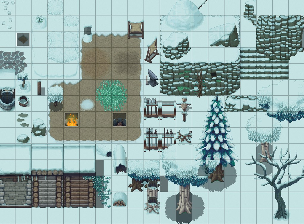
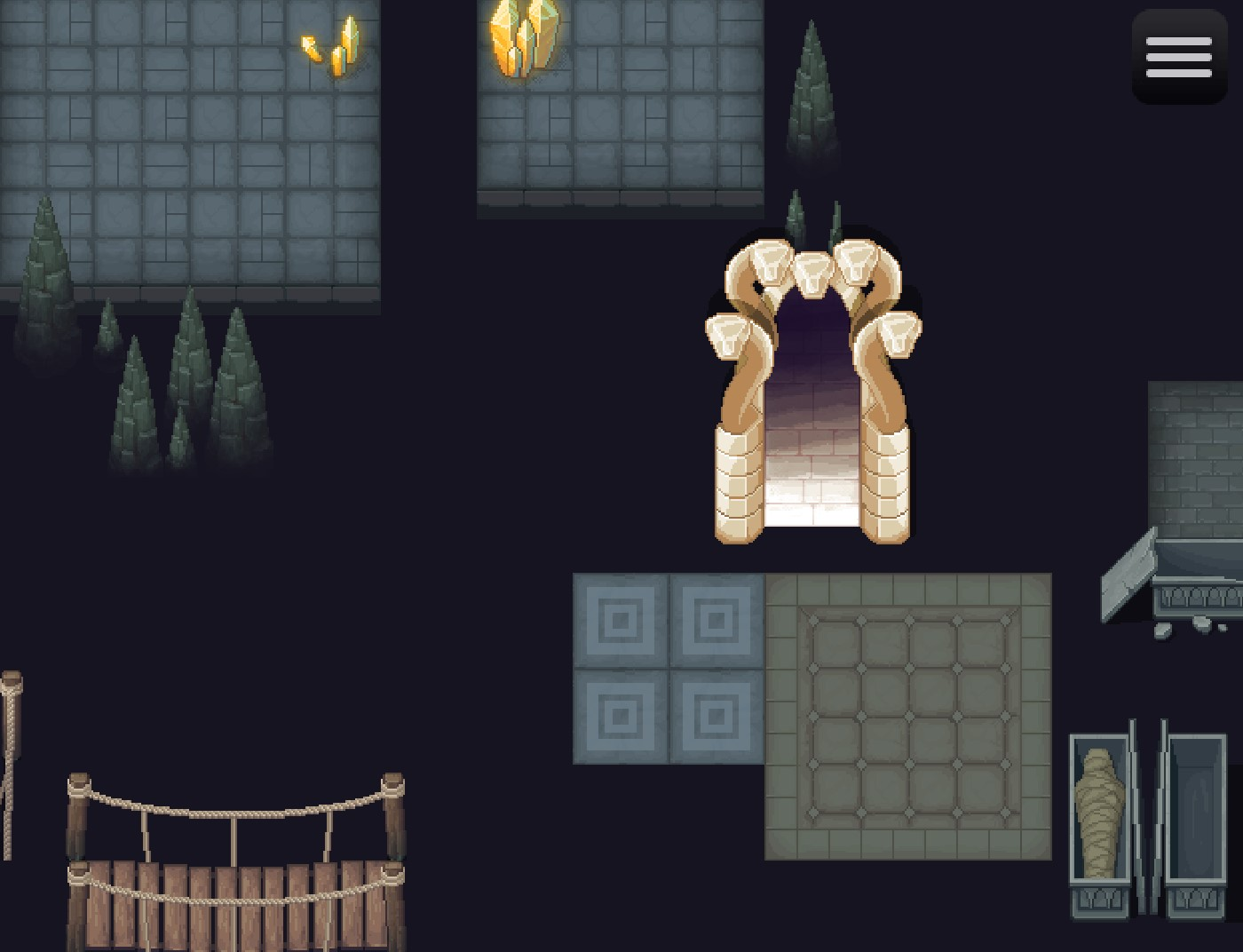
But first I needed some graphics. It was time to research tile sets!
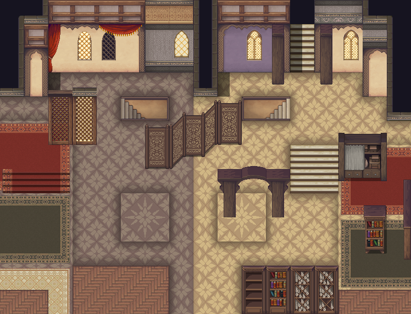
For starters, I thought about Time Fantasy, but that style hasn’t just been insanely popular for years—and the sprawling library has also become completely overwhelming. Although I’ll keep Time Elements, the younger sibling, in mind for future projects, I ultimately went with Winlu’s sets.
- They’re extensive, yet still manageable and well-organized.
- They’re not TOO overused in finished games.
- They’re archetypical in the best way, with that old SNES sense of wonder.
- They’re colorful, but slightly muted—so the color scheme matches the monster girls perfectly.
- And again: They’re just INSANELY pretty! =D
And yes, that’s when I actually invested some real money for the first time … at least if about €100 count as ‚real money,‘ or as ‚invested.‘
On a side note, when designing different biomes, I create style sheets for the tile set in question. After all, I don’t just want to use whatever comes to mind; I want elements that a) work together really well and b) create something memorable. Once that’s done, mapping goes much more smoothly!
Just hero things
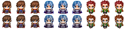
The character sprites, however, were a problem. First, there’s surprisingly not THAT much ready-to-use stuff that I subjectively love. Second, even less of that works well with Winlu’s tile sets. What helped in the end was a look back at the core concept (as it often does): I’m going for a stereotypical fantasy world. Narratively, our nameless hero positions himself so firmly at the center of this world that many NPCs would even be somewhat distracting. And since I already had images for the girls…
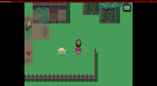
Back to the RTP! The standard MZ characters are, well, the STANDARD, and therefore fit perfectly into all of this—especially with the avatar selection the game offers.
I also got the recommendation to adjust the colors to match the muted Winlu palette—and I was surprised at how smoothly and effectively that actually worked:
You can see how all of these elements come together in the screenshots or the trailer on Steam. And although—in all honesty—I wouldn’t call Monster Girl Therapy a seriously stylish game, I think the visuals are pretty effective given the rather modest means.
What do you think?
Next time: Talking money
🇩🇪 Deutsch
Nachdem ich für mein erstes Spiel Vom Drachentöten nur die Standard-Ressourcen des RPG Makers benutzt habe, wollte ich beim zweiten auf die vielen coolen Dinge im Internet zurückgreifen. Dabei stellt sich gleich eine ziemlich zentrale Frage: Wie bastle ich daraus ein kohärentes Spiel?
Dafür brauchte es zuerst …
Ein Grundkonzept
Einmal in aller Kürze: Was IST Monster Girl Therapy?
Man nehme den Reiz einer Dating Sim, auch als Subgenre in Rollenspielen wie Persona oder Mass Effect, aber mit einem humorvollen, subversiven Blick auf Geschlechterdynamiken und andere Seltsamkeiten, die unsere Gamer-Kultur so hervorgebracht hat. Dazu kommen die Nostalgie der RPG-Maker-Optik sowie ein paar Minispiele und Rätsel, um das Ganze aufzulockern. (Ehrlich gesagt bevorzuge ich Spiele wie VA-11 Hall-A oder The Red Strings Club nämlich gegenüber „reinen“ Visual Novels, und Minispiele sind natürlich auch gleich eine wunderbare Übung für Maker-Skills!)
Diese Zusammenfassung habe ich vor knapp 2 Jahren als „Pitch“ an Jitsu Koan und TheRealFusion geschickt – ihre Monster Girls waren nämlich der Anlass, so richtig loszulegen. Und obwohl das Spiel letztlich doch ziemlich anderes geworden ist, sind die Monster Girls immer noch der Kern!
Mit Mädchen reden
Also, was macht diese Monstermädchenbildchen so toll?
- Sie haben eine kohärente, eigene Optik, die gut zum Maker passt.
- Sie sind im besten Sinne archetypisch, mit SOFORT erkennbaren Klischees …
- … aber sie sind nicht langweilig – einige haben eine MENGE Charakter!
- Sie sind einfach mal TOTAL ästhetisch! =D
Damit das auch gut herüberkommt, und weil das Gameplay zu großen Teilen aus Lesen bestehen würde, habe ich mich zuerst an die Dialoge gesetzt. Die technische Seite ist ein wenig Spielerei mit vier Bildern. (Hier ein alter Test … Sieht man die einzelnen Bestandteile?)
Stilistisch würden die Dialoge diesmal lockerer, alltäglicher ausfallen, aber ich wollte auch keine komplett unernste Parodie, von denen es in der Szene früher viel zu viele gab. Und letztlich war mir auch wichtig, dass jedes Monstermädchen seinen eigenen Duktus hat. (Mehr dazu ein anderes Mal.)
Farbe bekennen
Zu diesem Zeitpunkt war klar, dass die Spielwelt langsam zerfällt, was natürlich eine HERVORRAGENDE Gelegenheit ist, dem Spiel ein paar einprägsame Elemente zu verpassen … namentlich Neon-Pink und Neon-Grün! Denn wenn DAS im Kontext von Fantasy-RPGs nicht zeigt, dass irgendetwas schrecklich schiefgeht, was dann?
Und so hat sich im Zusammenspiel mit den Monstermädchen praktisch automatisch ein Farbschema für das Spiel entwickelt! Eine bunte, aber leicht gedämpfte Fantasy-Optik, und dazu aggressive Grafik-Glitches. Nice. Das würde auch noch mal massiv hilfreich werden, wenn es zwei Jahre später an die Vermarktung geht …
Die Welt erkunden
Aber erstmal brauchte ich natürlich eine Grafik. Also hieß es Tile Sets recherchieren!
Anfangs habe ich über Time Fantasy nachgedacht, aber dieser Stil ist nicht nur seit Jahren wahnsinnig beliebt, die ausschweifende Bibliothek ist auch noch völlig unübersichtlich geworden. Und obwohl ich den jüngeren Bruder Time Elements durchaus für weitere Projekte im Hinterkopf behalten werde, ist meine Wahl letztlich auf die Sets von Winlu gefallen.
- Sie sind umfangreich, aber trotzdem überschaubar und gut organisiert.
- Sie sind noch nicht ZU präsent in fertigen Projekten.
- Sie sind stereotypisch im besten Sinne, mit dem „Sense of Wonder“ alter SNES-Spiele.
- Sie sind bunt, aber leicht gedämpft – also farbschematisch passend zu den Monstermädchen.
- und abermals: Sie sind einfach nur MEGA ästhetisch! =D
Und ja, da habe ich dann das erste Mal richtig Geld investiert … zumindest wenn knapp 100€ schon als „richtig“ oder „investiert“ durchgehen.
Um die einzelnen Biome zu gestalten, erstelle ich mir übrigens immer „Style Sheets“ mit den jeweiligen Tile Sets. Schließlich will ich nicht einfach alles benutzen, was mir gerade in den Sinn kommt, sondern Elemente, die a) wirklich gut zusammen funktionieren und b) einen einprägsamen Charakter entwickeln. Danach läuft das Mappen deutlich reibungsloser!
Im Mittelpunkt stehen
Die Charakter-Sprites allerdings waren ein Problem. Zum Einen gibt es seltsamerweise gar nicht SO viel fertigen Kram, den ich subjektiv richtig geil finde, und zum Anderen noch viel weniger Kram, der sich wirklich gut mit Winlus Tile Sets verträgt. Letztlich hat – wie so oft! – ein Blick zurück zum Grundkonzept geholfen: Ich will eine stereotypische Fantasy-Spielwelt, und tatsächlich inszeniert sich unser namenloser Hauptheld auch schon narrativ so sehr als Mittelpunkt dieser Welt, dass eine Vielzahl an NPCs eher ablenkend wäre. Für die Monstermädchen hatte ich schon Bilder, also …
Zurück zum RTP! Die Standard-Charaktere des MZ sind, nun ja, der STANDARD, und der passt sich hervorragend in all das ein! Vor allem mit der Auswahl eines Avatars, die das Spiel bietet.
Zudem habe ich die Empfehlung bekommen, die Farben an die gedämpfte Winlu-Palette anzupassen, und war dann auch gleich überrascht, wie problemlos und effektiv das doch funktioniert hat:
Das Zusammenspiel dieser einzelnen Aspekte seht ihr auf den Screenshots oder im Trailer auf Steam. Und obwohl ich Monster Girl Therapy jetzt – ehrlicherweise – nicht als massiv stylisches Spiel bezeichnen würde, finde ich die Optik für diese eher bescheidenen Mittel doch ziemlich effektiv.
Was sagt ihr?
Nächstes Mal: Finanzfragen?
Schreibe einen Kommentar